Good and Bad Website Example: Zara vs Asos
Zara and Asos, both mid-range clothing companies, one from Spain, and the other from England, have grown into substantial businesses, both estimated in the billions it is interesting to see how their websites flow and operate. Zara had to be the lead in this for the bad example in this smackdown discussion due to how difficult it is to navigate their website. Zara's home page looks more like an art curators page rather than a clothing page due to how you move throughout the site and scrolling just moves the images rather than giving direction to the viewer of what clothing they are looking for. Though the site looks beautiful it is the primary discussion for web designers on how "not to build a website" and even in the blog by Moichiumi Gogoi, she commented that, "Zara has adopted a clever marketing tactic with their quirky way to display products to gain attention online. However, the truth is this bizarre campaign imagery has sent many shoppers into a state of confusion" (Gogoi, 2021).
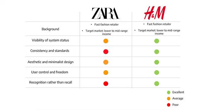
(a poll showing how users prefer to use the website from H and M rather than Zara from Gogoi's Study)
Asos, on the other hand, has a simple website that is well-designed. It has an intuitive navigation system,
making it easy for shoppers to navigate through the website. The layout of the
website is minimal, featuring large images and clean lines, which allow
visitors to focus on their shopping. It also has numerous features such as
product filters, product reviews, and a section that makes personal shopping
recommendations. All of these features make online shopping more efficient and
enjoyable.
Youtube link To Zara and Asos Smackdown
Cited works:
Gogoi, M. (2022, January 29). UX case study: Redesigning zara website to improve its web presence and user experience. Medium. Retrieved April 4, 2023, from https://bootcamp.uxdesign.cc/case-study-redesigning-zara-website-to-improve-its-web-presence-and-user-experience-8adcce374244


Mary! I like how you showed how Zara's website is art based, but not easy to navigate. I can agree since I just looked on their website today. ASOS, is a little easier to go through and pick your options. This is key for any shopper. It's not as artsy, but still works for them.
ReplyDeleteI thought your smackdown was interesting, because I have never used Zara or Asos so it was interesting to learn the advantages and disadvantages of each of their websites. I liked how in your video you showed recordings of the actual websites, so that we could get a feel for what you were talking about. I have never heard of Asos but is was clear that they have a better website structure than Zara.
ReplyDeleteHi Mary! Zara’s website does seem to be very colorful and simple, it is just pictures. It seemed like a portfolio to a person who wants to be a model and not clothing. Zara doesn't seem like they have a wide variety of clothes. Asos overall it seems like a better website and I can tell that it's actually for clothing
ReplyDeleteHey Mary! I agree with you how Zara’s home page looks like an art curators page rather than a clothing page. I think that Asos is much more organized with their website and I personally find it a lot easier to shop and navigate through it!! I really like how you included a poll as well.
ReplyDeleteHello Mary, thanks for sharing your 2.0 smackdown on Zara and Asos. Compared to many other clothing websites, Zara is challenging to access many clothing options, and as you say, it is more of an art gallery.
ReplyDelete